Clothes cleaned with the greatest care.
Laundry Kart came to Switch asking for a solution for an age old problem which is how to solve the hassle of filling data to order a simple cleaning service, and we did not disappoint them.
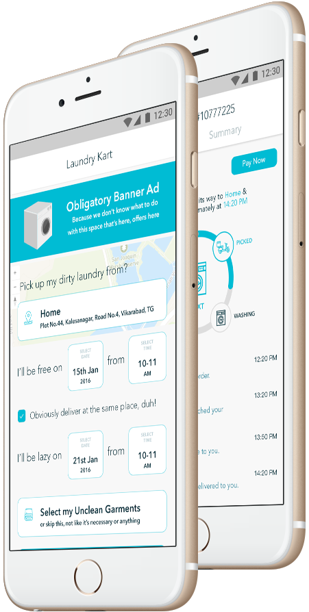
What did we do?
You can now order by simply clicking the button on
the home screen without entering any data if you so choose and the delivery guy will be right there at your doorstep to
take your order details verbally and take it down on his rider app.And not only did we do this, we also send the user live
notifications about the cleaning process.
In addition Switch also created a neat & clean backend systems to manage their business process & the fleet boys.
Market Research
To find what is lacking in the current UI/UX approach.
Adapt New
Bring in newer technologies to minimise offline dependency.
Parallel Development
To initiate a workflow for simultaneous design & development.
Streamline
To be open to change design or ux based on use case efficiency.
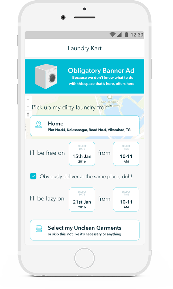
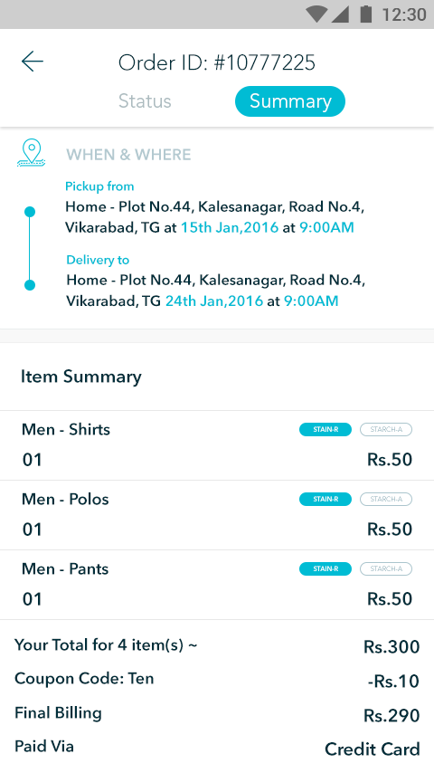
App Screenshots
Curating screens we love from the application.
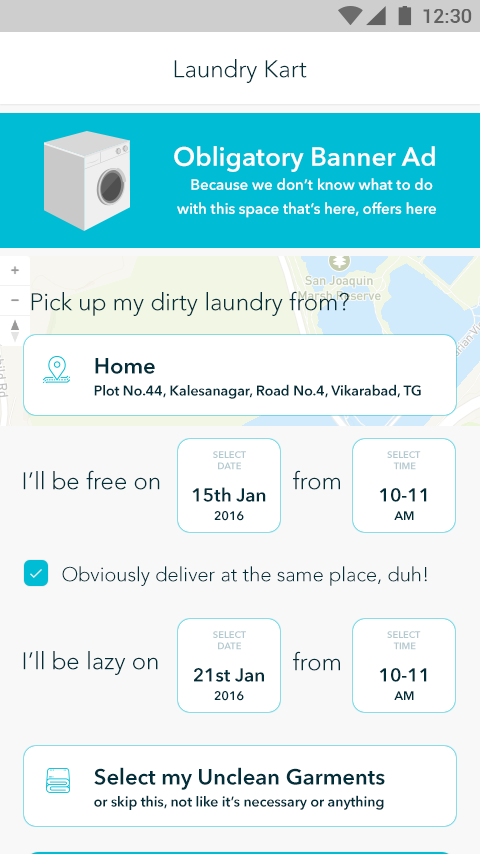
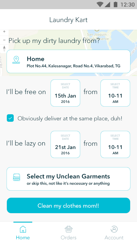
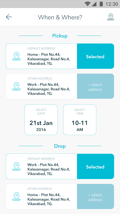
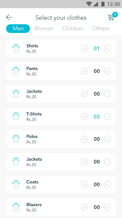
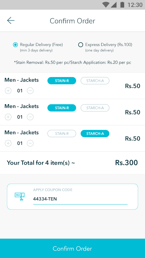
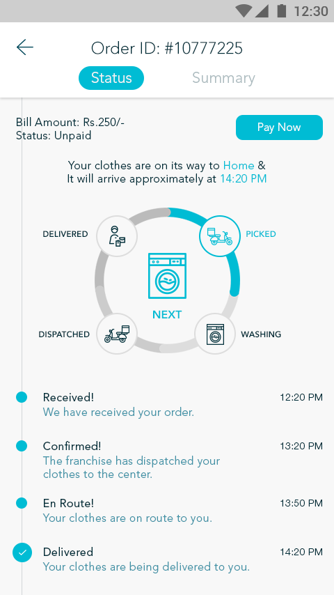

Applying Newer Technologies
Laundry is relatively an offline based business requiring a manager to run the ground operations, we had to come up with a backend system that automatically does the heavy lifting therefore eliminating the need for multiple management staff.

One Click Go
The primary discussion for Laundry Kart was making it easier for the customer to place an order with one click, basically not requiring for him to enter his/her location, just using current location as the pickup/drop point, which can later be edited. The mundane task of selecting category or types of clothes could be left onto the driver to fill in once he arrives.
The UI needed to be simple & elegant to be the perfect balance for the user to use it only when needed & yet be welcoming if opened at anytime.
